
TL;DR: Detectable warning surface colour requirements are about contrast, not a single mandated colour. Under CSA B651:23, attention indicators need at least 50% Michelson Contrast with the surrounding surface (or 40% if yellow). Direction indicators require 50% contrast and must not be yellow. The Ontario Building Code references ISO 23599, which sets thresholds of 30% for integrated units and 50% for discrete units. Yellow dominates in practice because it offers strong contrast against both concrete and asphalt.
Architects, municipal engineers, contractors, and facility managers specifying tactile walking surface indicators (TWSIs) for Canadian projects all face the same question sooner or later: what colour does the detectable warning surface need to be? The answer is more nuanced than most people expect, and getting it wrong can mean a failed inspection or, worse, a surface that visually impaired pedestrians cannot detect.
This guide breaks down the detectable warning surface colour requirements across Canadian, American, and international standards, explains how contrast is calculated, and covers the practical decisions that affect long-term compliance.
Browse compliant tactile indicators available for Canadian projects.
What Are Detectable Warning Surfaces?
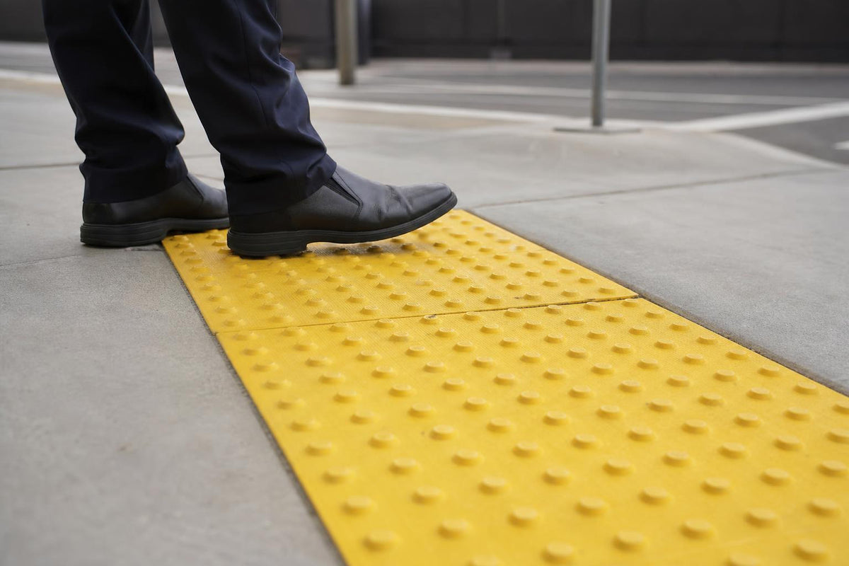
Detectable warning surfaces are the distinctive raised-dome (truncated dome) panels installed at curb ramps, transit platform edges, and pedestrian crossings. They serve as a tactile and visual cue, primarily for pedestrians who are blind or have low vision, signalling the boundary between a pedestrian zone and a vehicular or rail zone.
While the tactile element (the domes underfoot) provides the primary warning, the colour contrast component is what makes these surfaces detectable from a distance for people with partial sight. Research indicates that when luminance contrast reaches 70% or greater, roughly 95% of visually impaired users can detect the warning surface from eight feet away.
That’s why every major accessibility standard treats colour contrast as a core requirement, not an afterthought.
Canadian Standards for Detectable Warning Surface Colour
Canada’s detectable warning surface colour requirements come from several overlapping standards. Here’s what specifiers need to know about each one.
CSA B651:23, The Primary Technical Standard
CSA/ASC B651 is the standard most Canadian building codes reference for accessible design. Its colour rules for TWSIs are specific and sometimes misunderstood.
Attention indicators (the truncated dome panels at hazard points) must have a colour that contrasts at least 50% with the surrounding surface, calculated using the Michelson Contrast formula. There is one notable exception: if the indicator is yellow, the minimum drops to 40%.
This lower threshold for yellow exists because yellow is inherently high-visibility against most common walking surfaces. But the standard is clear that 50% is the minimum for all other colours, and “it is preferable to provide a higher visual contrast whenever possible.”
Direction indicators (the elongated bar pattern that guides pedestrians along a path) must also achieve at least 50% Michelson Contrast, but they must not be yellow. This rule exists to prevent confusion between attention indicators and direction indicators. A pedestrian who has learned that yellow domes mean “stop, hazard ahead” should not encounter yellow bars that mean “follow this path.”
If your project includes directional bar tiles, specifying a non-yellow colour from the outset avoids costly replacements later.
ISO 23599: The International Reference
The Ontario Building Code (Section 3.8.3.18) requires that tactile attention indicators conform to ISO 23599:2019. This international standard sets luminance contrast thresholds using the Michelson formula:
- Integrated TWSIs (where the indicators are part of a uniform-colour paving module): greater than 30% Michelson Contrast
- Discrete TWSIs (individual elements applied to or set into the surface): greater than 50% Michelson Contrast
The distinction matters. A cast-in-place panel that becomes part of the concrete pour is treated differently from a surface-applied panel bolted on top of existing pavement. Discrete, surface-applied products face the higher 50% threshold because the contrast boundary between the indicator and the surrounding surface is more abrupt and needs to be clearly readable.
For a deeper comparison of installation methods, see this guide on surface-applied vs cast-in-place tactile indicators.
Ontario Building Code and AODA
AODA (the Accessibility for Ontarians with Disabilities Act) mandated TWSIs at all new and redeveloped public spaces effective January 2016 under O. Reg. 191/11. The OBC’s Section 3.8.3.18 handles the technical specifics by pointing to ISO 23599 for contrast thresholds.
Neither AODA nor the OBC mandates a specific colour. They require “high tonal contrast” between the indicator and its surrounding surface, with ISO 23599’s Michelson formula serving as the measurement standard. For a broader walkthrough of AODA compliance, this AODA tactile requirements guide covers placement, sizing, and inspection steps.
CAN-ASC Wayfinding Standard (Emerging)
Accessibility Standards Canada is developing a new wayfinding standard that updates the luminance contrast framework. Under this emerging standard, attention indicator surfaces must have a difference in light reflectance value (or CIE Y-value) with their immediate surrounding surface:
- Greater than 30 points for integrated units
- Greater than 40 points for discrete units
- The lighter surface must have a minimum reflectance value of 50 points
This shift from percentage-based Michelson Contrast to LRV-point differences aligns more closely with ISO 23599 and makes field verification somewhat simpler. Specifiers working on federal or multi-jurisdictional projects should watch this standard closely.
U.S. Standards: ADA and State-Level Rules
Canadian specifiers working on cross-border projects, or simply comparing notes with American counterparts, should understand how the detectable warning surface colour requirements differ south of the border.
ADA Section 705.1.3 (Federal)
Federal ADA regulations do not require any specific colour. Detectable warnings must provide “stark visual contrast” with adjacent surfaces, either light-on-dark or dark-on-light. The recommended benchmark is a 70% light reflectance value (LRV) difference, though 60 to 70% contrast often yields good results in practice.
Yellow has become the de facto standard in the U.S. because of its high visibility and cultural association with caution, but many states and local jurisdictions allow other colours including brick red, black, gray, and blue.
California: The Exception That Requires Yellow
California Title 24, Section 11B-705.1.1.3.1, is the major outlier. It requires that detectable warning surfaces be yellow, approximating Federal Standard 33538 (commonly called “safety yellow”). This applies at transit platforms, bus stops, and hazardous vehicular areas throughout the state.
California also requires that the colour be integral to the panel material rather than a surface coating. Painted-on contrast is expressly prohibited. This integral-colour requirement is increasingly being adopted or recommended in other jurisdictions too, because surface coatings wear off under foot traffic and weather exposure.
How Colour Contrast Is Measured
Understanding the detectable warning surface colour requirements means understanding the math behind them. Two formulas dominate, and they produce different numbers for the same pair of surfaces.
Michelson Contrast (Canadian Standard)
The formula used by CSA B651 and ISO 23599:
C_M = (L1 - L2) / (L1 + L2) x 100
Where L1 is the luminance of the lighter surface and L2 is the luminance of the darker surface, both measured in candelas per square metre (cd/m²).
The key feature: the denominator is the sum of both values. This produces a more conservative number than the LRV method.
LRV Contrast Formula (U.S. Standard)
The formula commonly used under ADA guidance and California Title 24:
Contrast % = [(B1 - B2) / B1] x 100
Where B1 is the light reflectance value of the lighter surface and B2 is the LRV of the darker surface.
Here the denominator is only the lighter surface’s value, which produces a higher percentage for the same two surfaces.
Why the Difference Matters
A concrete sidewalk with an LRV of 50 paired with a cast-iron panel at LRV 11 would produce an excellent contrast score under either formula, well above any threshold. But for surfaces closer together in reflectance (say, a mid-tone red panel on weathered concrete), the Michelson formula will return a lower number than the LRV formula. A pair of surfaces that passes at 55% under the LRV method might only score 42% under Michelson.
This is why you cannot simply take an American contrast percentage and assume it meets a Canadian threshold. Always verify which formula the standard requires and calculate accordingly.
Practical Verification
Light reflectance value is measured on a scale from 0 (absolute black, absorbing all light) to 100 (pure white, reflecting all light). On site, a spectrophotometer or colorimeter can measure the LRV of both the TWSI and the surrounding surface. Many manufacturers also publish LRV data for their products, which simplifies the specification process.
For architects and contractors writing project specifications, requesting LRV test data from the manufacturer at the submittal stage avoids surprises during final inspection.
Why Yellow Dominates
Despite the fact that most standards do not mandate a specific colour, yellow accounts for the vast majority of detectable warning surfaces installed across North America. Several factors explain this.
Contrast performance. Yellow provides strong contrast against both gray concrete and dark asphalt, the two most common adjacent surfaces. This dual compatibility makes it a safe default for mixed-surface environments.
Cultural recognition. Yellow signals caution universally: traffic signs, school buses, hazard tape. Pedestrians, including those with partial vision, associate yellow ground markings with “pay attention here.”
Community preference. When the Seattle Department of Transportation solicited feedback from the disability community, including pedestrians with low vision and mobility instructors, the clear preference was for yellow detectable warning surfaces.
Specifier convenience. Because yellow meets or exceeds contrast thresholds in almost every installation context, it simplifies the specification process. As one civil engineering commentator noted, “designers, owners and developers aren’t always enthusiastic about scattering yellow stripes across their site,” but contrast with the surrounding walkway is the most important consideration.
That said, alternatives are gaining ground. Practitioners on engineering forums note that municipalities in New York and New Jersey are increasingly choosing safety red because “red implies stop” and can provide better contrast on light concrete sidewalks. Gray has traditionally been popular in New York City, though it is being phased out in favour of higher-contrast options.
Colour Must Be Integral to the Material
Multiple jurisdictions now require (or strongly recommend) that the colour of a detectable warning surface be an integral part of the panel material, not a surface coating or paint.
The logic is straightforward: a painted surface wears. Foot traffic, snow plows, de-icing chemicals, and UV exposure all degrade surface coatings. Within a few seasons, a painted panel can lose enough colour to fall below the required contrast threshold, rendering it non-compliant even though the tactile domes remain intact.
Through-body colour (where the pigment runs through the entire thickness of the material) ensures that normal surface wear does not reduce contrast. This is standard practice for composite, polymer, and cast-in-place panels. Cast iron takes a different approach: uncoated cast iron develops a natural patina from oxidation that provides effective visual contrast against lighter surrounding surfaces without requiring any pigment at all.
Common Compliant Colour Options
The detectable warning surface colour requirements give specifiers more flexibility than many realize. Here are the most commonly used colours and where they work best.
| Colour | Best Paired With | Notes |
|---|---|---|
| Safety yellow (FS 33538) | Gray concrete, dark asphalt | Most common worldwide; mandatory in California; gets lower CSA B651 threshold (40%) |
| Brick red / terra cotta | Light concrete, light stone | Popular in heritage districts and areas where yellow clashes with architecture |
| Safety red | Light concrete | Growing in popularity in eastern North America; strong “stop” association |
| Black | Light concrete, light stone | High contrast on pale surfaces; less effective on dark asphalt |
| Gray | Dark asphalt (if light gray) | Declining in popularity due to marginal contrast on concrete |
| Blue | Light surfaces | Uncommon; used in some transit systems for wayfinding distinction |
| Natural cast iron | Most surfaces | Develops dark patina naturally; excellent durability |
For projects requiring cast iron plates, the natural oxidation patina eliminates colour-fading concerns entirely, though inspectors should verify that rust accumulation does not obscure the dome profile over time.
Comparison Table: Standards at a Glance
| Standard | Minimum Contrast | Colour Mandated? | Formula | Key Note |
|---|---|---|---|---|
| CSA B651:23 (Canada, attention) | 50% (40% if yellow) | Yellow preferred, not required | Michelson | Yellow gets lower threshold |
| CSA B651:23 (Canada, direction) | 50% | Must NOT be yellow | Michelson | Prevents confusion with attention indicators |
| ISO 23599:2019 | 30% integrated; 50% discrete | No | Michelson | Referenced by OBC 3.8.3.18 |
| AODA / Ontario | Per ISO 23599 | No | Per ISO 23599 | “High tonal contrast” required |
| CAN-ASC (emerging) | 30 LRV pts integrated; 40 pts discrete | No | LRV point difference | Lighter surface must be 50+ LRV |
| ADA (U.S. federal) | “Visually contrast” (70% LRV recommended) | No | LRV | States may add colour rules |
| California Title 24 | 70% LRV | Yes, safety yellow (FS 33538) | LRV | Colour must be integral to material |
Maintenance: When Faded Colour Means Non-Compliance
Here is a detail that many project owners overlook: detectable warning surface colour requirements are not a one-time checkbox. Contrast must be maintained for the life of the installation. A panel that was compliant on installation day but has since faded, stained, or been coated with grime is no longer meeting its purpose.
Any panel where the colour contrast has visibly degraded should be scheduled for replacement. The same applies to panels where dome height has worn below approximately 0.15 inches or where a significant number of domes are damaged or missing.
Composite panels in moderate-traffic settings generally last 10 to 15 years before reaching the point where replacement is needed. Cast iron lasts longer but still needs periodic inspection, particularly for heavy rust that can obscure colour contrast. Establishing an annual inspection cycle that includes a visual contrast check (not just a dome-height check) is the simplest way to stay compliant.
For a broader look at testing and inspection protocols, the TWSI testing standards guide covers what to look for and when.
Frequently Asked Questions
Do detectable warnings have to be yellow in Canada?
No. CSA B651:23 does not mandate yellow. It requires a minimum 50% Michelson Contrast for non-yellow colours and a reduced 40% threshold for yellow. Yellow is preferred because of its high visibility, but brick red, black, and other colours are compliant if they meet the contrast minimum.
What is the required contrast percentage in Canada?
It depends on the standard and the type of indicator. Under CSA B651, attention indicators need 50% Michelson Contrast (40% if yellow). Under ISO 23599 (referenced by the Ontario Building Code), the threshold is 30% for integrated units and 50% for discrete surface-applied units.
Can direction indicators be yellow?
No. CSA B651:23 explicitly prohibits yellow for direction indicators. This rule prevents pedestrians from confusing directional guidance bars with attention warning domes.
How do I measure LRV on site?
Use a spectrophotometer or colorimeter held against both the TWSI surface and the adjacent walking surface. Measure in consistent lighting conditions. Many manufacturers publish LRV values for their products, which can be used during the specification phase and verified on site after installation.
What happens if the colour fades after installation?
A faded panel that no longer meets the contrast threshold is non-compliant, regardless of whether it was compliant when installed. Routine inspection should include a visual contrast assessment. Panels with degraded colour should be replaced.
Does the colour have to go all the way through the material?
Multiple jurisdictions require or recommend integral colour (pigment throughout the full thickness of the panel). Surface coatings and paint are prohibited in California and discouraged elsewhere because they wear off and reduce contrast over time.
What colour works best on concrete sidewalks?
Safety yellow and brick red both provide strong contrast against standard gray concrete (typical LRV around 40 to 55). Black also works well on lighter concrete. The best choice depends on the specific LRV of your concrete and any local colour preferences or regulations.
Choose the Right Colour for Your Project
Getting detectable warning surface colour requirements right starts with knowing your standard, calculating your contrast, and choosing a product with integral colour that will hold up under real-world conditions.
If you’re specifying TWSIs for a Canadian project and need help selecting the right colour, size, or installation method, contact Safety Step Canada for assistance. You can also browse the full range of tactile indicator products to see available colours, sizes, and pricing.